⚠️ Note that this post hasn't been updated for at least a year and the information may be outdated, proceed with caution! (Last updated: July 14, 2023)
Hiding a module based on your responsive breakpoints can be very useful.
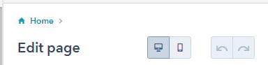
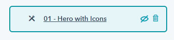
On the page editor, you can hide modules for a specific view by selecting "Edit for mobile" / "Edit for desktop" and then clicking the "Hide this module" icon on the specific module you want to hide.
But did you know you can also achieve this at template level? It works the exact same way as setting different padding/margin for a section on a template:
{% dnd_module
   path="@hubspot/rich_text",
     hidden={ "default":false, "mobile":true }
%}
{% end_dnd_module %}
That will hide the given module on mobile but show it on desktop!