As a HubSpot CMS Developer, I'm frequently asked how to best approach designing a website to be built in the HubSpot CMS. So I've put together what I consider to be best practices based on my knowledge of the HubSpot CMS and how I develop custom (or Marketplace) HubSpot themes.
The content editor's experience
The first thing to know is that the HubSpot CMS is incredibly flexible. So, technically, you can build almost any kind of website on HubSpot.
However, a key item to bear in mind when designing or developing on HubSpot is the content editor's experience. Most people bought HubSpot because they were sold on the CMS being "easy to use". However, the developer has full control over the website's editing experience so a theme can range from one that can't be edited at all to one where every last detail can be customized and everything in between.
There's always going to be a bit of a learning curve when using a new CMS, but in my experience, when users have a bad experience using HubSpot, it's typically because their theme or templates were developed by someone who wasn't familiar with the platform.
So it's essential to consider how the content editor will be able to customise your designs at every step of the design and development process.
Free HubSpot CMS Themes
HubSpot recently released HubSpot CMS Free along with many free themes on the HubSpot Marketplace, meaning that you can always test out the editing experience before getting stuck into your design.
If you're working with me or interested to see how I build themes, you can always test some of my own free HubSpot CMS Themes which follow the best practices I outline below.
HubSpot CMS Themes
A theme usually consists of the following:
- Theme Settings: these fields will update elements such as typography or buttons across every page that uses the website theme
- Modules: reusable components used in templates and pages. There are standard modules included by default in the HubSpot CMS (Image, Rich Text..) as well as custom modules that the developer creates (Sliders, Cards...)
- Global Partials: these are reusable elements that are used across the site such as the header, footer and sidebars.
- Templates: pre-built layouts that content editors can use as a starting point. There are website page, landing page, blog listings, blog post and system page type templates.
- Sections: these are full-width blocks on your template or page.
1. Theme Settings
A HubSpot theme should have theme settings that will allow the content editor to update styling across the board. Since they need to be built in by the developer, there can be as little or a many as they decide to add.
The theme settings on HubSpot's boilerplate theme, for example, looks like this:
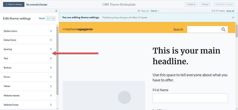
From a design perspective, think of this as setting up your design system. Based on HubSpot's boilerplate theme, their Marketplace requirements and my own personal experience, I'd recommend the following:
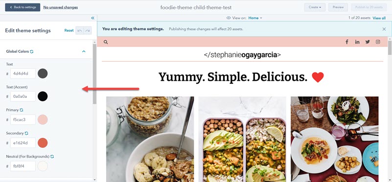
Global Colors
These are the colours that will be used across the theme and many of the other theme settings and custom modules will inherit these.
Personally, I keep it simple and usually have the following fields:
- Text
- Primary
- Secondary
- Neutral
But you can choose to add more if you like. These four colours are then inherited by other elements below, custom modules, sections or templates.
If you're using a tool like Figma, you can save these and reference them as you build your designs.
Typography
When a content editor is typing in HubSpot as I am now, they have a dropdown at the top where they can choose the type of text (Paragraph, Heading 1, Heading 2.. etc.). They also have options for setting the text style (bold, italic, underline), creating lists, links... etc. (*)

I'd recommend mapping out the font family (try to keep it to one or two to not slow down the site!), font size, font weight, font style and line height for each of these elements and then sticking to those across your designs:
- Headings (H1 - H6)
- Paragraphs
- Links
- Lists (ordered and unordered)
- Blockquote
- Code/Pre (* less likely to be used)
Something like this:
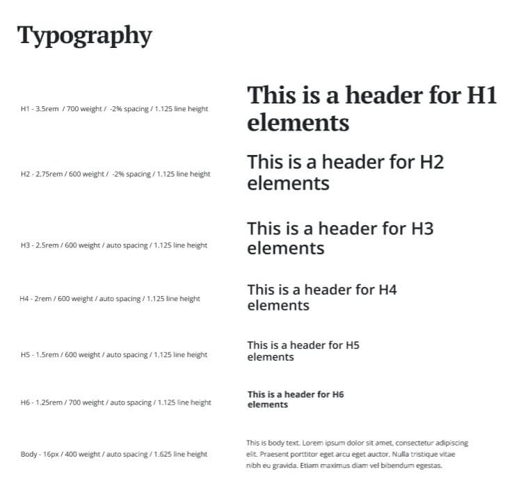
That way, any time you add any text element to your designs, it's something the content editor will be able to replicate in the Rich Text editor when they're updating the website with new sections, pages... etc.
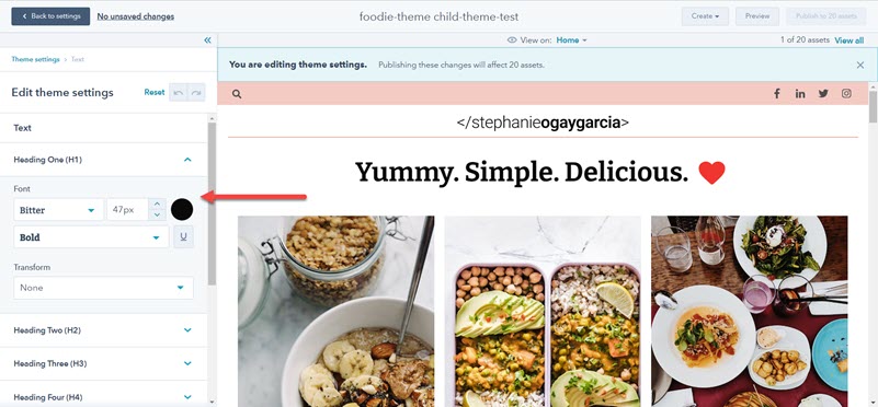
They can also be updated globally from the theme settings:
I've noticed some designers add some extra typography such as "extra large heading" (e.g. the homepage title) or "subtitle". This is ok, but then usually means we need to create a custom module to style those particular instances, making those sections a little less flexible.
(*) Note: within custom modules, if there's a Rich Text editor, the developer can disable a lot of options, such a preventing users from selecting a different font, bolding text, etc.
Spacing
The spacing section has fields to set the maximum content width and the default vertical space at the top and bottom of sections.
Personally, I'm a fan of an 8px spacing system (keeping all spacing as multiples of 8px) for consistency, so typically my default section vertical space will be 80px.
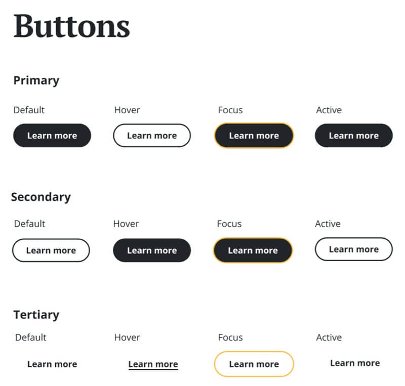
Buttons
I typically base mine on HubSpot's Boilerplate Theme and have fields for:
- Text
- Background
- Border
- Corner
- Spacing
- Focus
Sometimes I'll add in those fields for various button types. I might name these "primary", "secondary"... etc. or create ones called "solid", "outline", "arrow"... etc. with settings for each.
Button styling with their hover, focus and active states like the below is very helpful:
Forms
I typically base mine on HubSpot's Boilerplate Theme and have fields for:
- Background
- Border
- Corner
- Spacing
- Title
- Labels
- Help Text
- Field
- Buttons
I usually create a sample form that has all field types and make sure I've added styling for each:
- Single checkbox
- Multiple checkboxes
- Date picker
- File
- Number
- Radio select
- Dropdown select
- Single-line text
- Multi-line text
Note that for many of the above (dropdowns, textboxes, radio, date picker... etc) each browser tends to have their own styling. It can be incredibly hard to customise these and is often discouraged. I'd recommend sticking to the default styling.
Tables
I typically base mine on HubSpot's Boilerplate Theme and have fields for:
- Header (Text, Background)
- Body (Text, Background)
- Footer (Text, Background)
- Cells (Spacing, Border)
Website Header and Footer
It's useful to add fields to customise your website's header and footer from the theme settings. These will depend on your design and may be things like the background color, text, color, dropdowns... etc.
2. Modules
Modules are the various components on the page, such as text, image, hero, cards button... etc. These can be global (updating them updates the content in every instance of that module across the website) or local (you update the content on each particular instance).
Default Modules
HubSpot include a number of default module that users will have access to and you can find the full list here. You'll want to provide styling for these, many of which were included in the theme settings above:
- Call-to-Action (the button styling above will work for these)
- Forms
- Language Switcher (for multi-language content)
- Menu
- Simple Menu
- Rich Text (your typography styling above)
- Headings (your typography styling above)
Custom Modules
This is where you can get incredibly creative! Custom modules are reusable components that you'll use across your designs and that content editors can reuse across the website by dragging them into the page and editing their content and styling.
Some typical custom modules include:
- Sliders
- Cards
- Accordion/FAQs
- Pricing Tables
- Blog Posts
- ... etc.
When developing these, the developer can choose exactly what elements will be editable by adding fields to the module. The best practice is to separate these into two tabs: content and styling.
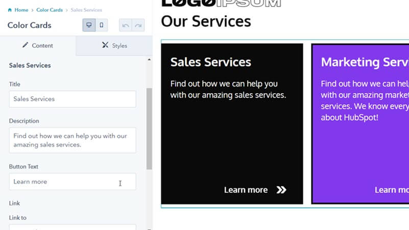
Content Tab
This contains all the actual content in the module. Fields available include: text, rich text, choice (dropdowns or radio select), boolean (checkboxes), images, date and time, file, links, forms, icons, menu, number, videos... etc.
For example, the cards below have a text field "Title", a text field "Description", a text field "Button Text" and a link field:
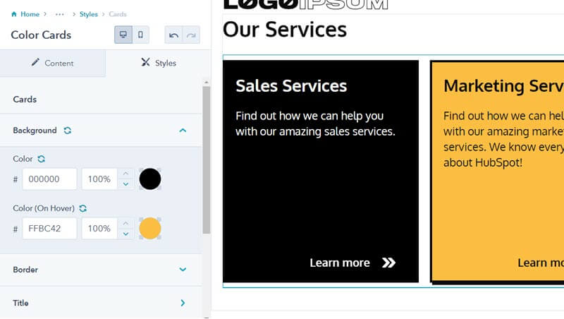
Styles Tab
This contains styling for the module. Fields available include: alignment, background image, color, font, gradient, spacing, text alignment... etc.
For example, the cards below have options to edit the background colour and colour on hover, the border colour, the title colour and colour on hover... etc.
3. Global Partials
Global Partials are reusable elements that are used across the site such as the header, footer and sidebars.
Typically, in my themes, the header will be less flexible in order to account for the mobile styling whereas the footer will be drag-and-drop. So you can be as creative as you like with the header and navigation.
Note that a standard best practice is to offer an alternate header with no navigation (the logo only) to be used in landing page templates.
4. Templates
Templates are pre-built layouts that content editors can use as a starting point when building their content. Some typical ones include: Homepage, About, Services, Contact, Blog Listings and Blog Post.
The HubSpot CMS was originally based on an earlier version of Bootstrap, so it uses a 12-column grid. Pages are built out of building blocks that consist of areas, sections, columns, rows and modules. I find the graphic here to be a useful reference:
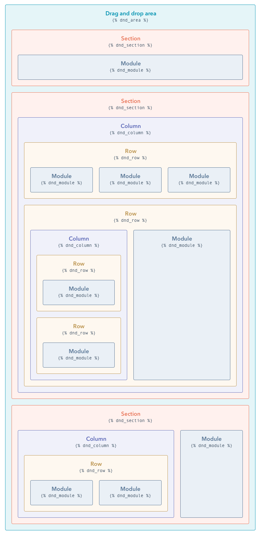
When editing a page, the user can click into these sections, columns and rows to update the background (image, colour or gradient), content width (in the case of sections) and spacing.
Some designs might require a custom module or section that removes some of the flexibility, such as overlapping elements or animations. Consider discussing these with your developer to make sure that they don't have a negative impact on the content editor's experience.
System Pages
HubSpot also has several system pages. Many have default modules that are somewhat rigid in their layout, so I'd recommend not deviating too much from HubSpot's defaults.
These are:
- 404 and 500 Error Pages
- Email Subscription Pages (Subscription Preferences, Unsubscribe, Subscription Confirmation)
- Membership (Login, Register, Reset Password)
- Search Results
- Password Prompt
5. Sections
Sections are full-width blocks on the page. Recently, HubSpot's implemented a feature to create pre-built sections.
These can be handy for things like hero banners, call-to-action banners, layouts with several columns... etc.
Summary
In short, everything should be thought of in terms of reusable components that can be used across the site, edited and moved around as needed.
There should be a basic design system with elements such as colours, typography (using standard HTML elements like headings, paragraphs, lists...), buttons, forms... etc.
There should be global components such as the header and footer and all other elements should be built as modular components (cards, sliders, accordions...) that can fit into any width on a 12-column grid.
Common Questions
Can I add animations?
Yes. However, typically to add an animation to an item in web development, you need to add a class (e.g. "fade-in") to that animation. So it usually needs to be done in a custom module.
You can also use custom modules to add in things like LottieFiles.
What breakpoints exist?
By default, the 12-grid column drag-and-drop layout will break at the 768px mark at which point all modules will stack up in a single column.
For global partials, custom modules... etc. you can also add in additional custom breakpoints.
Resources
- HubSpot Developers: Drag and Drop Areas
- HubSpot Developers: Module and Theme Field Types
- CMS for Marketers Certification - section 3 has a useful overview on how to edit pages