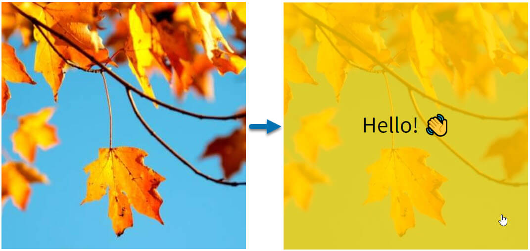
This tutorial will walk you through how you can create a simple, customisable module that displays a clickable image that has an overlay colour and text on hover, like this:
Add fields to your custom module
Once you create a new module (you can call it "Image with Colour Overlay"), you can add the following fields on the right-hand side.
For each one you'll select the right field type (in parenthesis), give them a name and ensure that their variable name matches what appears in code styling below. If you need to add additional options to the fields, details will be given.
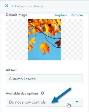
- Background Image (Image) |
background_image: the image you'll choose for the background. Choose a default image and, under "Available size options", set it to "Do not show controls"
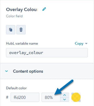
- Overlay Colour (Color) |
overlay_colour: the colour that will appear on hover. Be sure to set the opacity to less than 100!
- Overlay Text (Rich Text) |
overlay_text: this is the text that will appear in your module on hover - URL (Link) |
url: the url the user will be redirected to when clicking on your box. - Minimum Height (px) (Number)
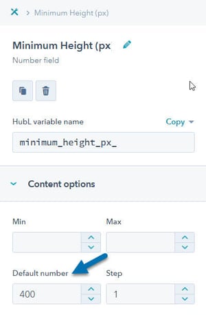
- Minimum Height (px) (Number) |
minimum_height_px_: Set a number that is the minimum height your box should be (in pixels)
Your module's fields should now look something like this:
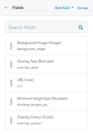
Make sure that the field names match the ones above or the code below will not work. The order of the fields does not matter, although you can rearrange them to what feels most natural to you.
Add code to your module
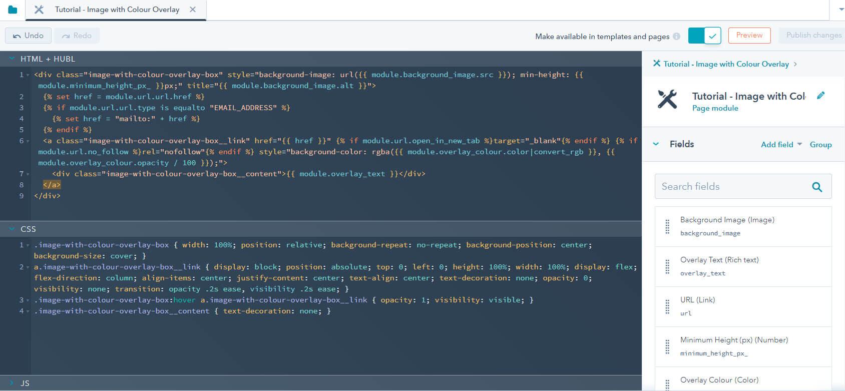
In the HTML + HubL section of the module, add in the following code:
{% raw %}<div class="image-with-colour-overlay-box" style="background-image: url({{ module.background_image.src }}); min-height: {{ module.minimum_height_px_ }}px;" title="{{ module.background_image.alt }}">
{% set href = module.url.url.href %}
{% if module.url.url.type is equalto "EMAIL_ADDRESS" %}
{% set href = "mailto:" + href %}
{% endif %}
<a class="image-with-colour-overlay-box__link" href="{{ href }}" {% if module.url.open_in_new_tab %}target="_blank"{% endif %} {% if module.url.no_follow %}rel="nofollow"{% endif %} style="background-color: rgba({{ module.overlay_colour.color|convert_rgb }}, {{ module.overlay_colour.opacity / 100 }});">
<div class="image-with-colour-overlay-box__content">{{ module.overlay_text }}</div>
</a>
</div>
In the CSS section, add in the following code:
.image-with-colour-overlay-box { width: 100%; position: relative; background-repeat: no-repeat; background-position: center; background-size: cover; }
a.image-with-colour-overlay-box__link { display: block; position: absolute; top: 0; left: 0; height: 100%; width: 100%; display: flex; flex-direction: column; align-items: center; justify-content: center; text-align: center; text-decoration: none; opacity: 0; visibility: none; transition: opacity .2s ease, visibility .2s ease; }
.image-with-colour-overlay-box:hover a.image-with-colour-overlay-box__link { opacity: 1; visibility: visible; }
.image-with-colour-overlay-box__content { text-decoration: none; }
Your module should now look like this:
Use your module in a template or page
You can now drag your module into any template or page and can adjust the background image, colour and content that appears on overlay, the URL and the minimum height of the module.
It should expand to fit the full width of the container that you add it to and have a minimum height of what you've set it to.
Notes and additional customisation
Note: Because there is a link in the module on hover you might see some additional styling pulled in from your site. For example, my website adds an underline on hover so I had to add in this extra line on the CSS to remove that:
a.image-with-colour-overlay-box__link:hover { text-decoration: none; }
This will vary from one website to another.
Remove the link
If you would prefer not to have a link, you can remove the URL field and update the HTML + HubL code as follows:
<div class="image-with-colour-overlay-box" style="background-image: url({{ module.background_image.src }}); min-height: {{ module.minimum_height_px_ }}px;" title="{{ module.background_image.alt }}">
  <div class="image-with-colour-overlay-box__overlay" style="background-color: rgba({{ module.overlay_colour.color|convert_rgb }}, {{ module.overlay_colour.opacity / 100 }});">
    <div class="image-with-colour-overlay-box__content">{{ module.overlay_text }}</div>
  </div>
</div>
and the CSS as follows:
.image-with-colour-overlay-box { width: 100%; position: relative; background-repeat: no-repeat; background-position: center; background-size: cover; }
.image-with-colour-overlay-box__overlay { display: block; position: absolute; top: 0; left: 0; height: 100%; width: 100%; display: flex; flex-direction: column; align-items: center; justify-content: center; text-align: center; opacity: 0; visibility: none; transition: opacity .2s ease, visibility .2s ease; }
.image-with-colour-overlay-box:hover .image-with-colour-overlay-box__overlay { opacity: 1; visibility: visible; }
Update the transition speed
In the CSS above, the speed with which the overlay appears is set on this snippet:
transition: opacity .2s ease, visibility .2s ease;
You can update the .2s to any other time (in seconds), such as .5s or 1s.
Additional functionality
Adding additional functionality to this module is a little outside of the scope of this tutorial but you can do more. For example, I often group the fields above and set a repeater so that you can have more than one box in the module, and then use CSS Flexbox so that they will display side-by-side at the same height regardless of the amount of content you add in.