When you use a Form module on your HubSpot website, the markup for your checkboxes will look something like this:
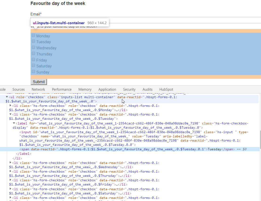
For simplicity, the above is a form module within a "page-center" container using only the default styling from the original HubSpot Boilerplate CSS.
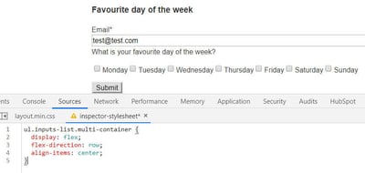
Stack the checkboxes horizontally
One thing you may want to do is to stack the checkboxes from left to right. You can do this using Flexbox, like this:
ul.inputs-list.multi-container {
  display: flex;
  flex-direction: row;
  align-items: center;
}
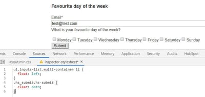
or using a Float (set a clear to the next field or button to prevent it from stacking up as well):
ul.inputs-list.multi-container li {
  float: left;
}
.hs_submit.hs-submit {
  clear: both;
}
Change the checkbox styling
Another thing you may want to do is set a different styling to your checkbox. Because you can't style checkboxes this is usually done by hiding the actual checkbox and adding in a fake one using a span in the markup (see an example here).
In HubSpot the radio button markup looks like this (I've stripped it down for simplicity):
<li class="hs-form-checkbox" role="checkbox">
  <label class="hs-form-checkbox-display">
    <input class="hs-input " type="checkbox" value="monday">
    <span>Monday</span>
  </label>
</li>
We can use CSS to hide the default input element above and then use pseudo-selectors on the span element to create the checkbox and the checkmark that appears on click:
/* Custom Input */
ul.inputs-list.multi-container li.hs-form-checkbox {
  margin: 16px 0;
}
ul.inputs-list.multi-container li.hs-form-checkbox label {
  position: relative;
}
ul.inputs-list.multi-container li.hs-form-checkbox label span {
  display: inline-block;
  margin-left: 40px; /* Width of the new radio select and any additional spacing on the left */
  margin-right: 16px; /* Additional spacing on the right */
}
/* Hide the original checkbox */
ul.inputs-list.multi-container li.hs-form-checkbox label input {
  height: 24px;
  left: 0;
  opacity: 0;
  position: absolute;
  top: 0;
  width: 24px;
}
/* Add new checkbox */
ul.inputs-list.multi-container li.hs-form-checkbox label span::before {
  border: 2px solid;
  content: "";
  height: 24px;
  left: 0;
  position: absolute;
  top: 0;
  width: 24px;
  border-radius: 4px;
}
/* Style new checked item */
ul.inputs-list.multi-container li.hs-form-checkbox label span::after {
  content: "";
  border: 4px solid;
  border-left: 0;
  border-top: 0;
  height: 16px;
  left: 8px;
  opacity: 0;
  position: absolute;
  top: 2px;
  transform: rotate(45deg);
  transition: opacity 0.2s ease-in-out;
  width: 8px;
}
/* Show when checked */
ul.inputs-list.multi-container li.hs-form-checkbox label input:checked + span::after {
  opacity: 1;
}
/* Style when focused */
ul.inputs-list.multi-container li.hs-form-checkbox label input:focus + span::after {
  outline: 3px solid transparent; /* For Windows high contrast mode. */
}
The above snippet looks something like this which you can preview here:
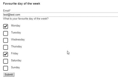
You can play around with the above styling to customise this further: change the border size on the checkbox or the checkmark, change the checkmark's positioning... etc.
To learn about customising radio buttons on HubSpot, you can read this post.